Shopify Customization: Dynamic Tabs and Sliding Collection Selectors Made Easy with HTML, CSS, JavaScript, and Shopify Schema Integration

Tabs are used to organize content on a webpage. The blog covers creating dynamic tabs with a sliding collection selector using HTML, CSS, JavaScript, Shopify Schema. Shopify comes with this feature where you can not only have multiple tabs for each type of product, but also add slider with it and add to card option where you can directly add the product from just by looking at the picture without opening the product.
1.Getting Started:
- Set up the basic structure for the tabs.
- Include jQuery UI library for tabs functionality.
- Include Slick carousel library for the sliding effect.
- Ensure you have included both libraries in your project.
HTML Code:-
{{ 'multi-tab.css' | asset_url | stylesheet_tag }}{% if section.blocks.size > 0 %}
< div class="tabs-section page-width">
< link rel="stylesheet" href="//code.jquery.com/ui/1.13.2/themes/base/jquery-ui.css">
< script src="//code.jquery.com/jquery-3.6.0.js">
< script src="//code.jquery.com/ui/1.13.2/jquery-ui.js">
{% if section.settings.useslider %}
< script src="//cdnjs.cloudflare.com/ajax/libs/slick-carousel/1.8.1/slick.min.js">
< link rel="stylesheet" type="text/css" href="//cdnjs.cloudflare.com/ajax/libs/slick-carousel/1.8.1/slick.min.css">
< link rel="stylesheet" type="text/css" href="//cdnjs.cloudflare.com/ajax/libs/slick-carousel/1.8.1/slick-theme.min.css" >
{% endif %}
{% if section.settings.title != blank %}
< h2 class="h1">{{ section.settings.title }}
{% endif %}
< div id="tabs" class="tabs">
{% assign tabContent = '' %}
< ul>
{ % for block in section.blocks %}
{ % assign collection = collections[block.settings.collection] %}
< li>
{{ collection.title }}
< /li>
{ % capture content %}
< div id="tabs-{{ collection.id }}">
< ul class="grid product-grid grid--2-col-tablet-down grid--4-col-desktop">
{% for product in block.settings.collection.products limit: 8 %}
< li class="grid__item scroll-trigger animate--slide-in">
{ % render 'card-product',
card_product: product,
media_aspect_ratio: section.settings.image_ratio,
image_shape: section.settings.image_shape,
show_secondary_image: section.settings.show_secondary_image,
show_vendor: section.settings.show_vendor,
show_rating: section.settings.show_rating,
show_quick_add: section.settings.enable_quick_add,
section_id: section.id
%}
< form method="post" action="/cart/add" class="add-to-cart-form">
< input type="hidden" name="id" value="{{ product.variants.first.id }}">
< input type="submit" value="Add to cart" class="btn add-to-cart-button">
< /form>
< /li>
{% endfor %}
< /ul>
{% if block.settings.viewall %}
< div class="center collection__view-all scroll-trigger animate--slide-in">
< a class="button" href="{{ block.settings.collection.url }}"> View all < /a>
< /div>
{% endif %}
< /div>
{ % endcapture %}
{ % assign tabContent = tabContent | append: content %}
{% endfor %}
< /ul>
{{ tabContent }}
< /div>
< /div>
{ % endif %}
*schema code :-
---------------- {% schema %}{
"name": "Tabs",
"settings": [
{
"type": "text",
"id": "title",
"label": "Title"
},
{
"type": "checkbox",
"id": "useslider",
"label": "Use slider",
"default": true
}
],
"blocks": [
{
"type": "tab",
"name": "Tab",
"limit": 5,
"settings": [
{
"type": "collection",
"id": "collection",
"label": "Collection"
},
{
"type": "checkbox",
"id": "viewall",
"label": "Show view all",
"default": true
}
]
}
],
"presets": [
{
"name": "Tabs",
"blocks": []
}
]
}
{% endschema %}
*:- --------
*JS Code:-
< script>$( function() {
{% if section.settings.useslider %}
function tabSlider(){
$('.tabs .product-grid.slick-initialized ').slick('unslick');
$('.tabs .product-grid ').slick({
dots: false,
arrows: true,
infinite: false,
speed: 300,
slidesToShow: 4,
slidesToScroll: 4,
responsive: [
{
breakpoint: 1024,
settings: {
slidesToShow: 3,
slidesToScroll: 3,
infinite: true
}
},
{
breakpoint: 600,
settings: {
slidesToShow: 2,
slidesToScroll: 2
}
},
{
breakpoint: 480,
settings: {
slidesToShow: 1,
slidesToScroll: 1
}
}
]
});
}
{% endif %}
$( "#tabs" ).tabs({
create: function( event, ui ) {
{% if section.settings.useslider %}
tabSlider()
{% endif %}
},
activate: function( event, ui ) {
{% if section.settings.useslider %}
tabSlider()
{% endif %}
}
});
} );
2.Adding CSS Styles: Style the tabs and slider using CSS.
CSS Code :-
.tabs .slick-track .grid__item {
padding: 0 5px;
}
.tabs .slick-next {
right: 0;
}
.tabs .slick-prev {
left: 0;
}
.tabs .slick-next,
.tabs .slick-prev {
transform: none;
top: -20px;
}
.tabs .slick-next::before,
.tabs .slick-prev::before {
color: #000;
}
.tabs .slick-slider {
margin: 0 -5px;
}
.tabs .collection__view-all a {
color: white !important;
}
.tabs {
background: none !important;
border: none !important;
}
.tabs.ui-tabs .ui-tabs-nav {
background: none;
padding: 0;
display: flex;
justify-content: center;
border: none;
}
.tabs-section h2 {
text-align: center;
}
.tabs.ui-tabs .ui-tabs-nav li {
border: none;
background: none;
}
.tabs.ui-tabs .ui-tabs-nav li a {
color: #800eadc4;
padding: 5px 40px;
border-radius: 50px;
}
.tabs.ui-tabs .ui-tabs-nav li.ui-tabs-active a {
background: #87ca76;
}
/* CSS for the Add to Cart button */
.add-to-cart-form {
margin-top: 10px; /* Adjust spacing as needed */
}
.add-to-cart-button {
/* Add your styles for the "Add to Cart" button here */
}
.add-to-cart-form {
text-align: center;
}
.add-to-cart-form .add-to-cart-button {
background: #a1e4cd;
color: white;
border: unset;
padding: 6px 10px;
border-radius: 6px;
cursor: pointer;
}
.card__heading {
height: 80px;
}
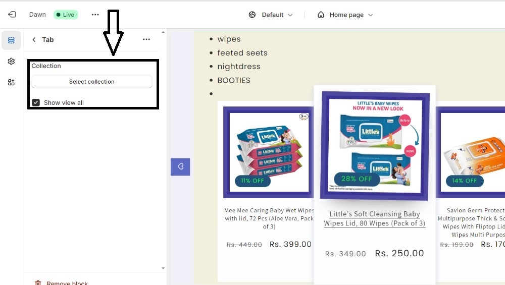
3.Configuring the Schema:
- Use Shopify's schema for customization.
- Users can select collections to display in each tab through the schema configuration.
4.JavaScript Functionality:
- Write JavaScript to handle tab switching and sliding collection selector.
- When a tab is clicked, it shows the corresponding collection selector and hides others.
- Dynamically load collection options for the selected tab into the sliding selector.
- Add event listeners to the tabs for switching between them.
- Implement sliding animation for smooth transitions.
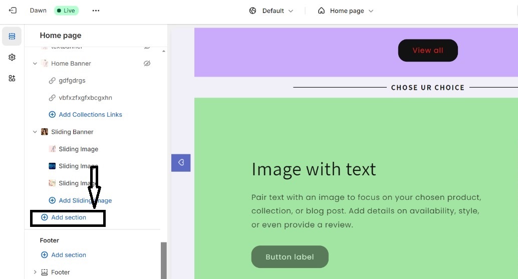
5. Customizing Your Shopify Theme:
- Customize your free Shopify theme.
- Choose multi-tab option in the add section.
- Upload images in multitab section.
- Save the customization.
Conclusion:
In this blog, we've learned how to create dynamic tabs with a sliding collection selector. Users can easily customize the tabs' content through the Shopify schema settings. Experiment with different styles and functionalities to enhance the user experience on your website.
That's it for now!


Comments