How to Make a Custom Marquee Using CSS Animation
In this blog, we will discuss how to make a custom marquee using CSS animation. Nowadays the marquee tag is not used in development because of the following:
- It conflicts with the other design and functionality of a project.
- There are overwrite issues in design with other elements.
- Issues in javascript animation functions (Toggle, Fade, etc.)
So we need to make a custom animation by CSS exactly like a marquee for that we need to follow the steps.
.custom-mq {
               width: 450px;
               height: 250px;
               margin: 0 auto;
               white-space: nowrap;
               overflow: hidden;
             }

.custom-mq>div {

            display: table-row;
            white-space: nowrap;
            padding-left: 0;
            animation: custom-mq 5000ms linear infinite;
            /* Time must be adjusted based on total width of scrolled elements*/
                 }

.custom-mq>div p {

            width: 450px;
            height: 250px;
            display: flex;
            align-items: flex-end;
            justify-content: center;
        }
Step 1: Add the code to your CSS for structuring the marquee.
/* Make it move */

@keyframes custom-mq{
0% {
    transform: translate(0, 0);
   }
    100% {
             transform: translate(0, -100%);
         }
    }
Step 2: Add the code to CSS to make it moveable.
My Custom Marquee
Step 3: Add the code to HTML file.
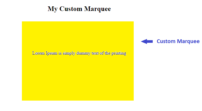
This is the result:

** Now the challenge is to stop marquee on mouse hover and start on mouse out.
So, there is the following code:
.custom-mq>div:hover {
            -webkit-animation-play-state: paused;
            -moz-animation-play-state: paused;
            -o-animation-play-state: paused;
            animation-play-state: paused;
                 }
After that, it will run smoothly.
This process is very important for any software development for CSS animation. Please read the blog carefully and follow the steps and share your feedback in the comment section.


Comments